Columbia Care
Precise, approachable medical cannabis
Columbia Care had acquired a unique patent for controlling the dose of vaporized marijuana oil through electric currents.
Columbia Care partnered with Siberia to take their product from concept to user’s hands.
I led the design for all user touch points, from brand identity and packaging to the consumer app functionality and design.

As the industry is still in its infancy, medical marijuana feels a bit like the wild wild west. This has left consumers (and patients) feeling confused.
Driven by the needs of a patient suffering with an illness and trying to find ways of self treatment whilst challenging their social anxiety around marijuana consumption, we had a clear goal to change perception.
Branding development through UI iterations
With no brand style in place, I created key user screens with various design approaches, exploring color, type, and layout. This allowed me to hone in on the brand image the client was after while getting feedback on key features. We landed on a style that was ethereal and calming using soft colors, fluid shapes, and soft edges.
Guided from the start
The app walks users through each step of the process from onboarding, pairing the device, inserting a cartridge, and device usage with signposts and teaching moments along the way and throughout the experience
The Prodose app: The key to personalization
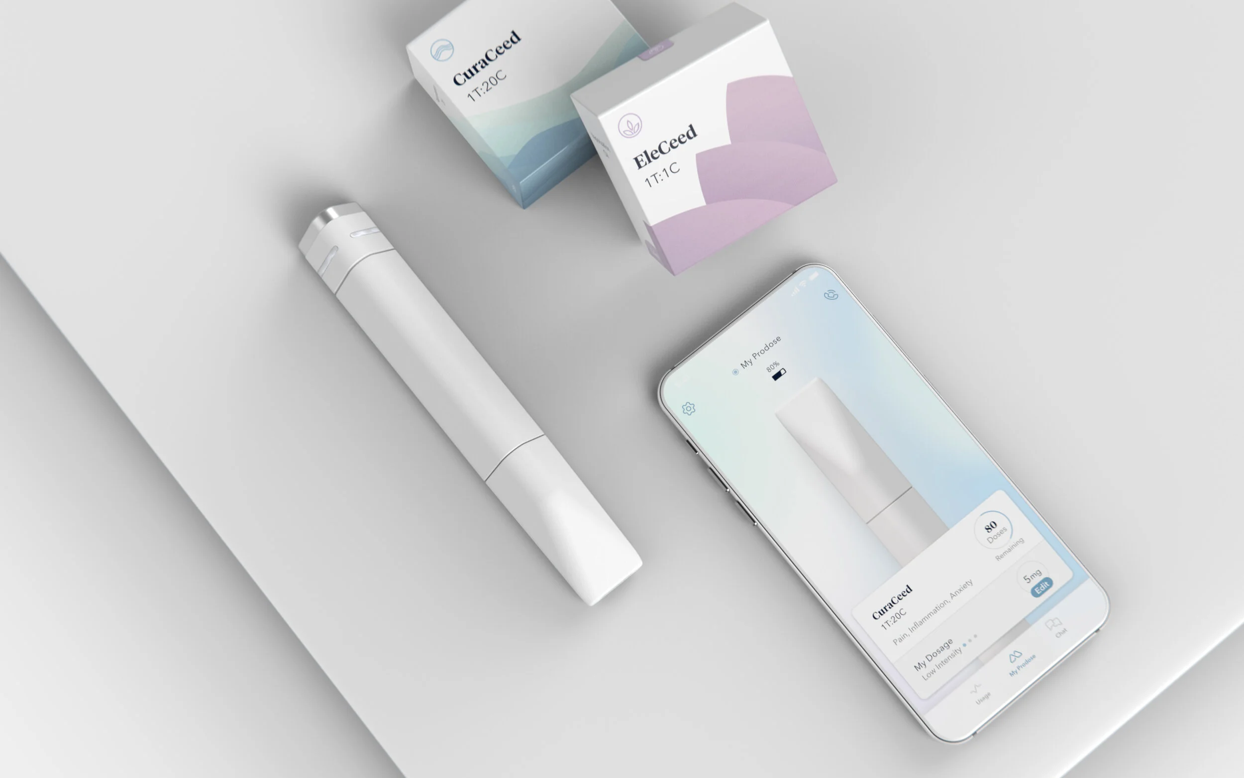
The companion Prodose app gives innovative tools to optimize the experience: dial in a dosage level, take a guided session to get feedback and recommendations, view your usage history, and chat with a pharmacist with any questions or concerns.
Prodose Manager: Patient Experience Platform
Pharmacists can activate devices, view detailed usage histories, and correspond with patients to help them optimize their experience. While admin users can pull reports to see trends and track product efficacy.
Expressing approachability through every touch-point
To ensure all touchpoints of the experience felt consolidated, reassuring and approachable we created a system that linked sub-brands and physical items to in-app experiences, unified under a sleek discrete logo mark.
Color has purpose. Every strain will have a color associated with it so patients can simply identify their preferred strain. The app interface changes color when a new strain is connected.
Pack It Up
There were two parts to the packaging – the oil cartridges (bought often) and the vape pen (bought once).
We kept the vape pen package simple and white as the color comes into play with the cartridge.
We focused on packing the cartridges efficiently in a square shape and easy to spot with the cartridge color throughout.


